The second thing: Picking Colors for Charts and Figures
I wanted to make a post on two things -- Europa and picking colors that go well together -- but the Europa part got long, so I moved the color thing to a separate post. This one.
This probably won't excite or impress you unless you've found this to be a problem, but I found several tools for picking out optimal sets of colors for making attractive diagrams.
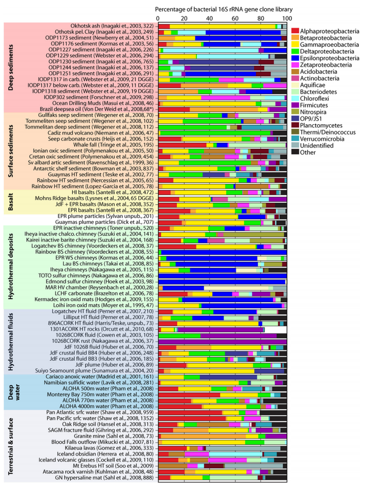
I remember seeing the following figure several years ago. Every day. Because I printed it out and taped it next to my computer. The specific bars don't matter so much, to tell the truth, but those citations listed next to each one make up an incredible list of sources that I wouldn't have been able to put together myself otherwise. I relied on it for checking up on a lot of things when working as a deep-sea marine biologist. It's from a review from 2012 that remains an outstanding piece of scientific writing. Dense as hell, but super, super, informative.
Anyway, in addition, it always struck me how well balanced the colors are. You wouldn't guess it because it looks so natural, but picking out 19 colors that will coexist peacefully on a page is a nearly impossible task. Check out some examples below if you don't believe me.


Microsoft Excel and LibreOffice have some default colors that aren't too bad, but if you add more than four it really tends to get ugly. The default setting is to select those random colors. And if you try and use shades of one color it tends to really go off the rails. If you're trying to compare two things each at three different intensities and you think you can have different shades of hot colors and cool colors to group things, you'll waste hours and wonder why your figure looks like garbage. Even if you think it looks okay, you don't know how it will look when printed, or on a projector. Can it be photocopied? Is it discernible to the color-blind? Almost certainly not. It may sound like I'm kidding, but this is a serious issue. My former adviser was color-blind. It's not that rare.
Well it turns out the problem isn't that I have a terrible sense of color... although I do, and it certainly doesn't help. The point is, though, that our eyes and brains just work weird. To give an example, your monitor isn't actually capable of producing the color yellow. It can mix red and green in such a way, though, that you see yellow. More trippy explanations can be found in this YouTube video.
Anyway, it's not just me. Picking colors that look natural is deceptively challenging. Fortunately, I found this online guide: "R Color Cheatsheet". The cheatsheet is intended as a guide for use in the R statistics system, but it includes this cool link, which is useful even if you aren't using R.
If you specify how many colors you need it'll offer a balanced set that looks good. It's worth checking out.

So is this one.
I found it because I wanted to convert colors from colorbrewer2 for use in PowerPoint. Powerpoint lets you specify colors based on the balance of red, green, and blue (RGB format). Colorbrewer specifies colors in "hex triplet" format. This website will convert between them and a bunch of other formats. It also suggests colors that go well together..
I've been using these while making a figure.
 This is a little sample from a draft figure I've been making at work. The content isn't really relevant, though I'll definitely discuss it in a future post. The point is, I'm really excited by these figures and these color selecting tools.
This probably won't excite or impress you unless you've found this to be a problem, but I found several tools for picking out optimal sets of colors for making attractive diagrams.
I remember seeing the following figure several years ago. Every day. Because I printed it out and taped it next to my computer. The specific bars don't matter so much, to tell the truth, but those citations listed next to each one make up an incredible list of sources that I wouldn't have been able to put together myself otherwise. I relied on it for checking up on a lot of things when working as a deep-sea marine biologist. It's from a review from 2012 that remains an outstanding piece of scientific writing. Dense as hell, but super, super, informative.
"FIG. 7. Composition of bacterial communities in various dark ocean habitats based on the percentages of different bacterial phyla documented in clone libraries of the 16S rRNA gene containing nearly full-length sequences. Each line represents a different sample set from one environment. The numbers after the references indicate the numbers of sequences in the sample clone library. Samples are grouped by habitat type, as indicated in the far left margin. Abbreviations and acronyms: pel., pelagic; ODP, Ocean Drilling Program; IODP, Integrated Ocean Drilling Program; carb., carbonate; HT, hydrothermal; HI, Hawaii; JdF, Juan de Fuca Ridge; EPR, East Pacific Rise; chalco., chalcopyrite; BS, black smoker; WS, white smoker; HV, hydrothermal vent; LCHF, Lost City hydrothermal field; ALOHA, Station ALOHA, Pacific Ocean, north of Hawaii; srfc, surface; SAGM, South African gold mine; GN, Guerrero Negro, Baja, CA. References correspond to reference numbers 60, 64, 88a, 93, 124, 166, 186, 196a, 202, 213, 215, 219a, 224, 232, 240, 242, 289, 290, 293, 307a, 335a, 346, 346a, 354, 357a, 372, 386, 392, 397, 400, 407, 409, 414, 424, 442, 443, 444, 447, 449, 456, 467, 476, 479, 499a, 506a, 518, 520, 535, 544, 566, 580a, 581, 590, 591, and 592."
Microsoft Excel and LibreOffice have some default colors that aren't too bad, but if you add more than four it really tends to get ugly. The default setting is to select those random colors. And if you try and use shades of one color it tends to really go off the rails. If you're trying to compare two things each at three different intensities and you think you can have different shades of hot colors and cool colors to group things, you'll waste hours and wonder why your figure looks like garbage. Even if you think it looks okay, you don't know how it will look when printed, or on a projector. Can it be photocopied? Is it discernible to the color-blind? Almost certainly not. It may sound like I'm kidding, but this is a serious issue. My former adviser was color-blind. It's not that rare.
Well it turns out the problem isn't that I have a terrible sense of color... although I do, and it certainly doesn't help. The point is, though, that our eyes and brains just work weird. To give an example, your monitor isn't actually capable of producing the color yellow. It can mix red and green in such a way, though, that you see yellow. More trippy explanations can be found in this YouTube video.
Anyway, it's not just me. Picking colors that look natural is deceptively challenging. Fortunately, I found this online guide: "R Color Cheatsheet". The cheatsheet is intended as a guide for use in the R statistics system, but it includes this cool link, which is useful even if you aren't using R.
If you specify how many colors you need it'll offer a balanced set that looks good. It's worth checking out.

So is this one.
I found it because I wanted to convert colors from colorbrewer2 for use in PowerPoint. Powerpoint lets you specify colors based on the balance of red, green, and blue (RGB format). Colorbrewer specifies colors in "hex triplet" format. This website will convert between them and a bunch of other formats. It also suggests colors that go well together..
I've been using these while making a figure.
Comments
Post a Comment